Creating an effective dashboard to prove an ad campaign was impactful
Telecommunications Giant | 2025 | 6 weeks
Team: 3 product managers, 2 UX designers
Role(s): Designer, Strategist, Writer
Tools: Lucidspark, Figma
Problem
Usability testing revealed that a simple graph displaying reach and frequency in relation to impressions was not enough information for the key user group (ad salespeople)
Users felt the graph would not be understood by their advertising clients
Users need more digestible information to effectively sell advertising campaigns to clients and demonstrate their performance
Solution & Outcome
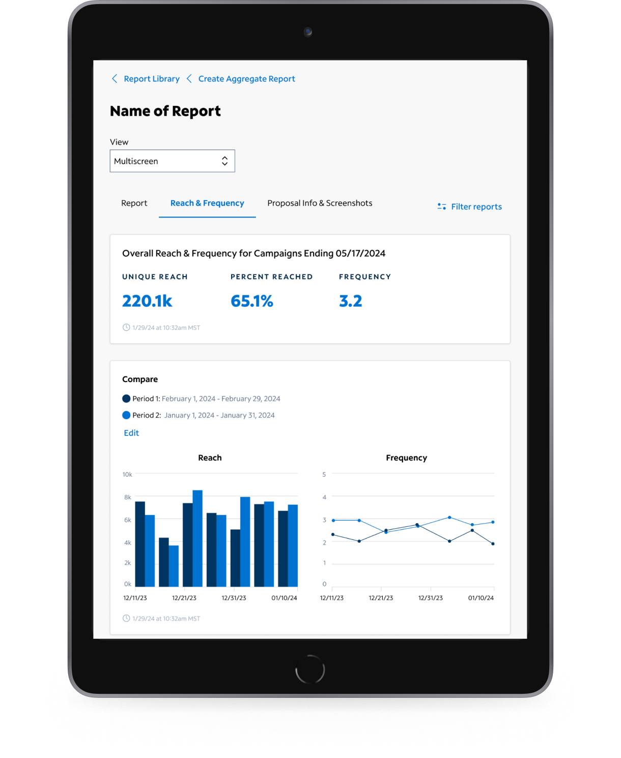
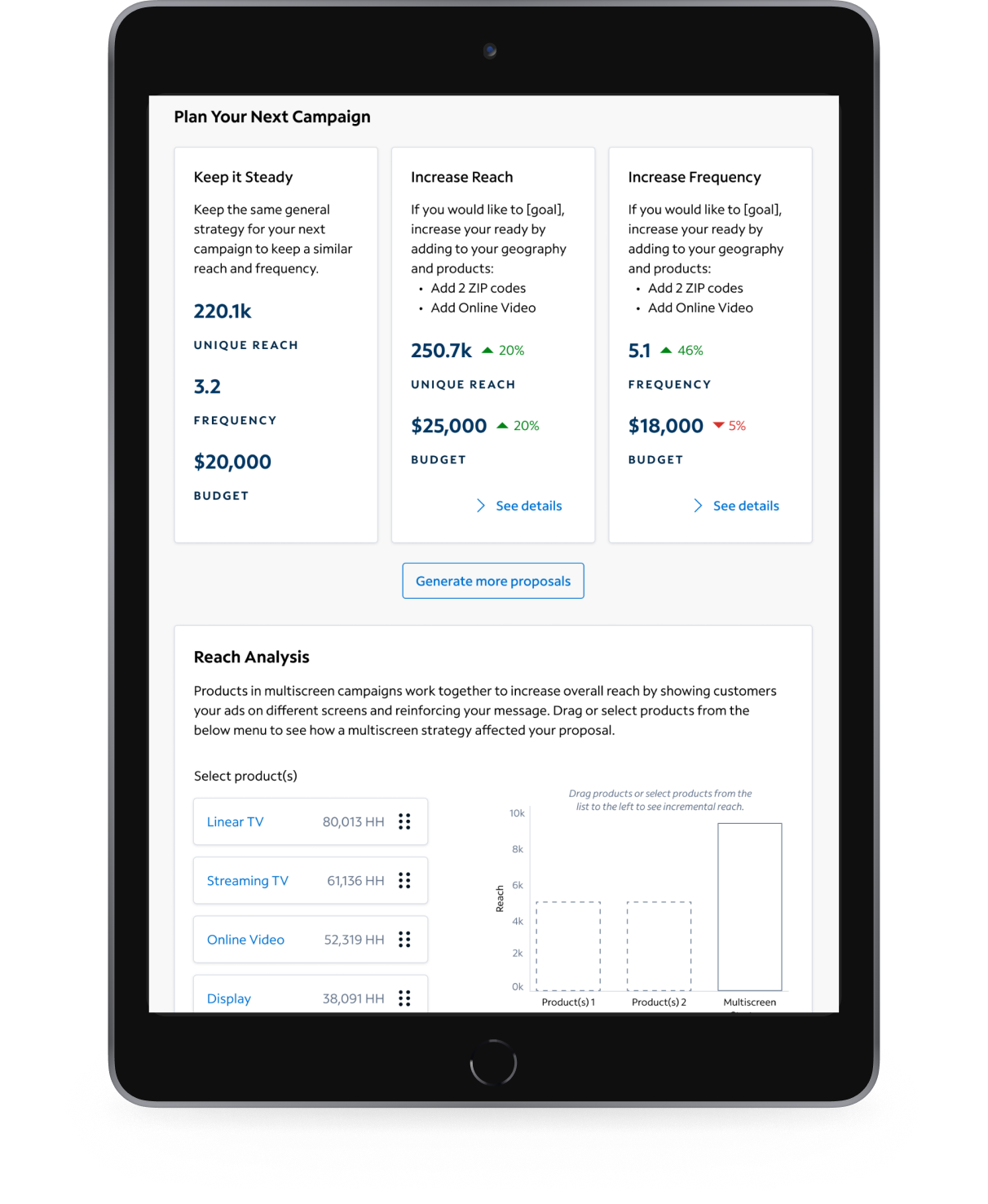
I designed a reach and frequency dashboard that helps salespeople effectively report reach and frequency to their clients.
Initial usability testing revealed users understood the information in the dashboard and felt it would be more useful to their clients than the previous designs.
Lo-fi design iteration + Workshop sessions
Approach
Created lo-fidelity design concepts based on the business requirements in order to communicate initial concepts to stakeholders
Conducted a 60 minute workshop with key stakeholders to gain feedback on design direction
Iterated on the original designs and led another 60 minute workshop to gain additional feedback and direction in order to make sure hi-fi designs met business needs
Created a flow and layout for the page and iterated on the design concepts further based on feedback
Led a third working session to get sign-off on design, as well as page layout and navigation to ensure what was tested with users was valuable
Workshop 1Workshop 2Workshop 3Areas of Tension
Initial disconnect over what exactly were the metrics the business needed communicated to sales people
Concern from development that they would not be able to execute certain data visualizations
Data visualization was something the design team did not have a lot of experience in
Brought in additional stakeholders later on in the process who had feedback that contradicted with the original requirements we had designed against
Final Designs
Based on the 3 workshop sessions, I created final flows, layouts, and designs in the lo-fidelity environment.

I translated the final lo-fi designs to hi-fidelity assets, I created and merged any necessary design library components, and I created a prototype for usability testing.
Outcomes
Stakeholders and product managers were more satisfied with the final design because they had a chance to have input on designs early and often in the process.
We spent less time making high-fidelity designs and more time ensuring we were going in the right direction.
Leveraging the hi-fidelity prototype, my team conducted usability testing with our user group.
All users found the Reach and Frequency dashboard to be useful, innovative, and projected that it would be effective in helping sell future advertising campaigns to their clients.
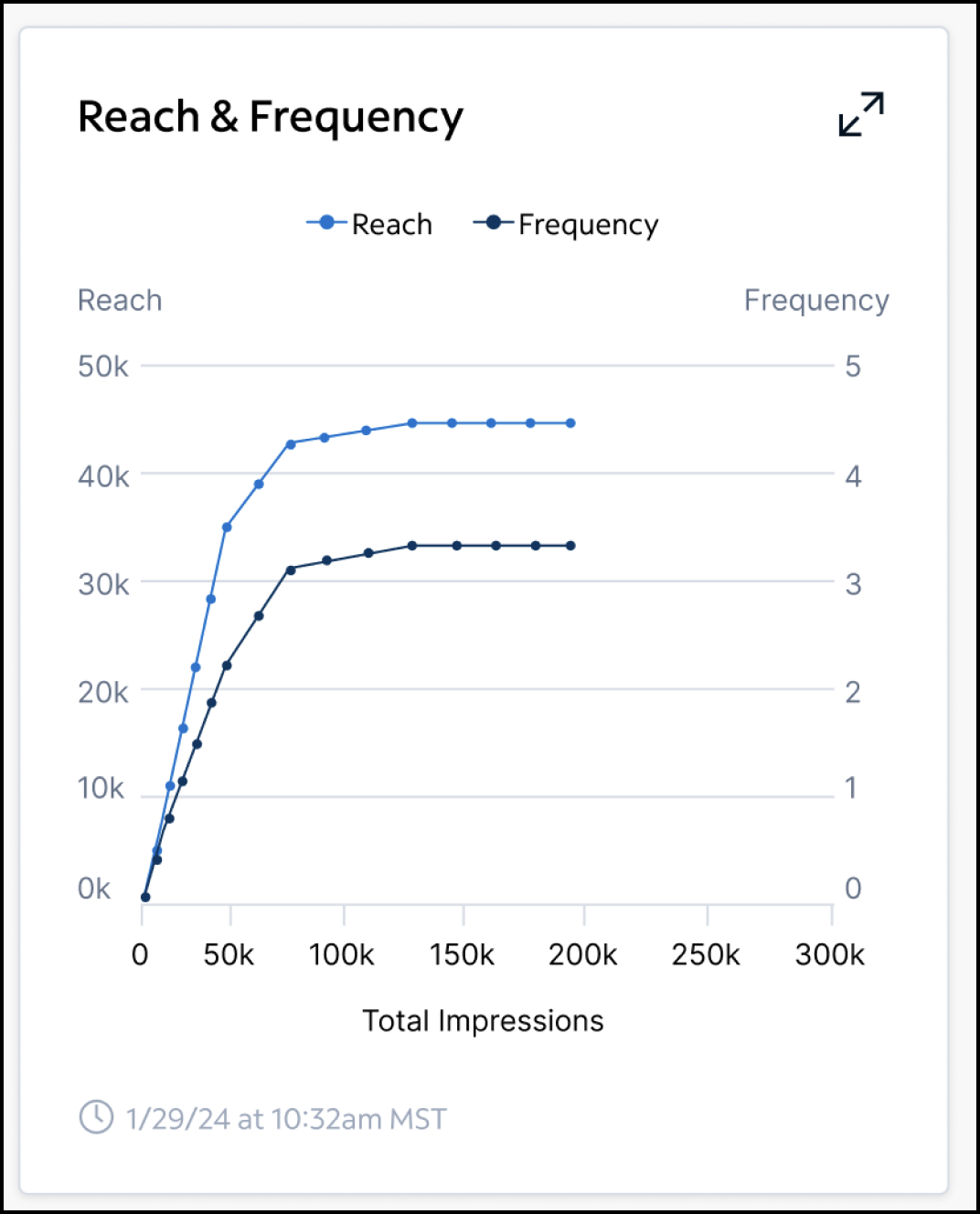
Initial R&F module design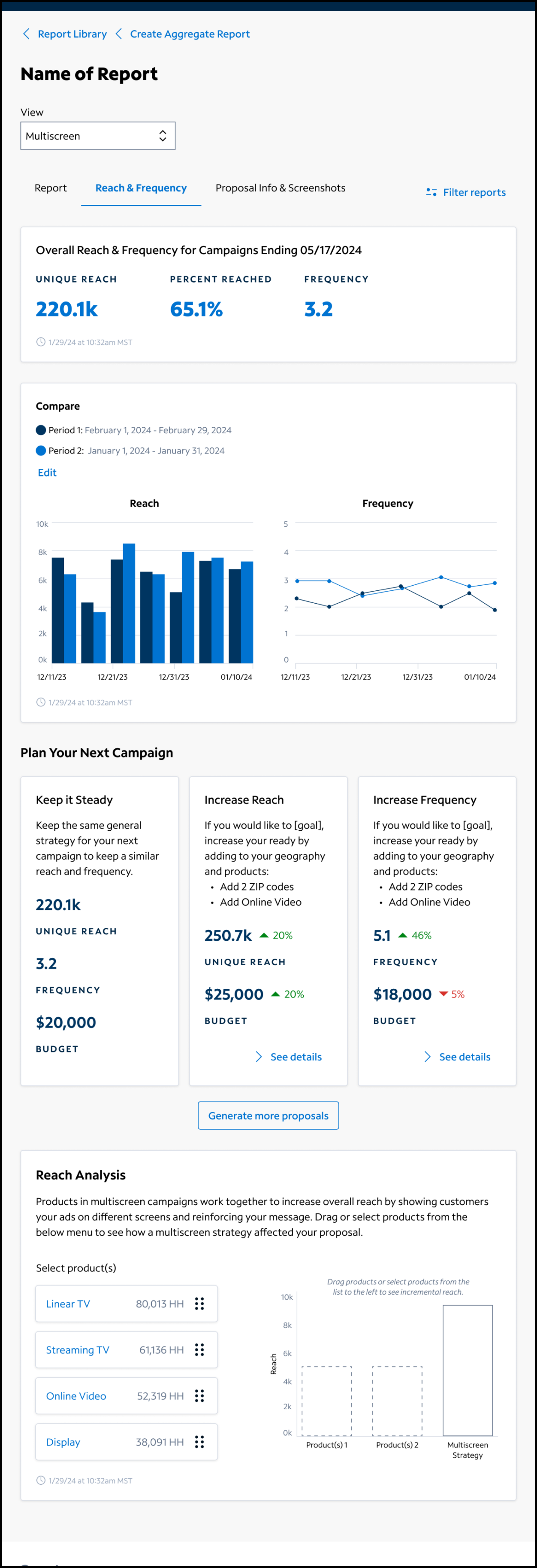
Final R&F dashboard design