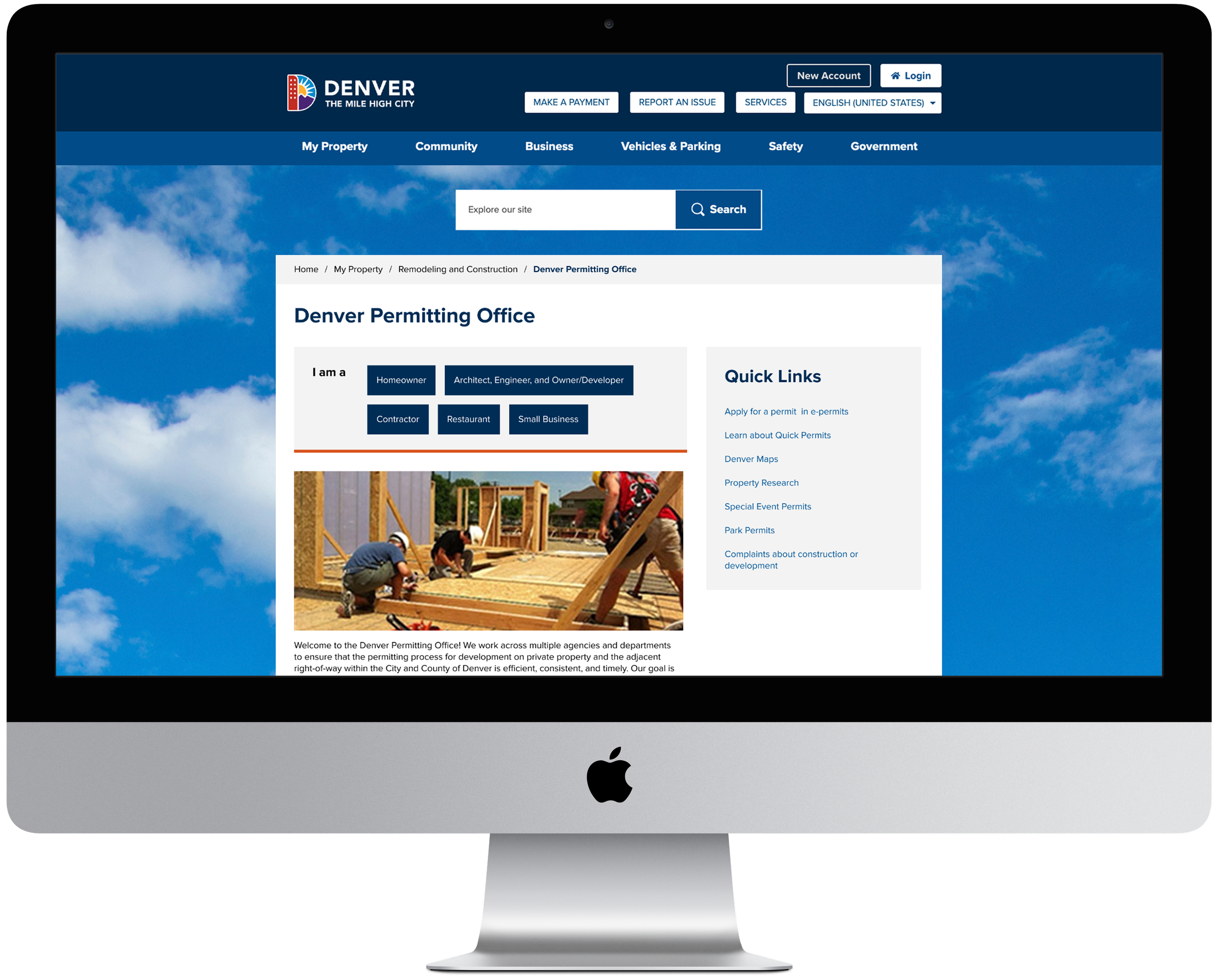
Redesigning Denver’s permitting website to reduce customer service call volume
City and County of Denver | 2025 | 12 weeks
Team: 1 UX designer
Role(s): Strategist, Designer, Researcher
Tools: Lucidspark, Figma
Background & Problem
Denver’s permitting website was created in order to easily link users to key resources or applications they may need for a home, business, or development project
The website heavily relied on in-line links and had poor hierarchy, making it difficult for users to find what they needed and leading to a high volume of customer service calls to an already busy government office
Solution & Outcome
I conducted a site audit, created new site maps, drafted wireframes and tested the updated designs with users
Simultaneously coordinated with development to ensure that proposed design changes were feasible on a short timeline and within a limited design template
The updated site uses navigation that guides users to resources based on the type of permits different user groups need (Homeowner, Business, Restaurant, Contractor, Developer)
User testing proved that the site was preferable and easier to use for all user types, and stakeholders were thrilled with the new design
Call volume reduced following the updates being published on the site
Site Audit & Mapping
Site audit conducted to determine key areas for improvement
I audited the existing site against a set of heuristics to determine where the site had usability issues. The following were the key findings and recommendations:
Findings:
Inconsistent buttons, navigation, and layouts disrupt a predictable user experience.
Limited top-level navigation and inconsistent categorization make information hard to find.
Heavy reliance on CPD links and isolated pages reduces visibility and forces extra steps.
PDFs and forms are inconsistently placed, scattering important resources across sites.
Recommendations:
Consistent navigation, layouts, and link behaviors will improve predictability and efficiency.
Stronger site visibility, persistent sub-navigation, and grouping by type/task will improve wayfinding and clarity.
Integrating CPD content and consolidating permits will boost search visibility and simplify navigation.
Convert PDFs to webpages or clearly label them when used.
Site map and user flows to visually communicate recommendations to stakeholders
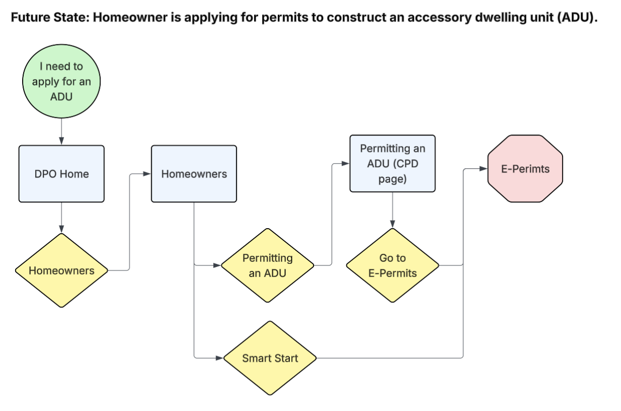
Next, I created a site map of the current state of the site and a future state site map with proposed updates in line with the above recommendations. I leveraged these to create user stories and flows that demonstrated the improved user experience with the future state version in order to communicate to stakeholders the key changes and the importance of these changes.
User stories:
Homeowner is applying for permits to construct an accessory dwelling unit (ADU).
Local chef is applying for building and health permits to open a new restaurant.
Developer is applying for construction permits to build a new 4-story office building.
Landlord is applying for mechanical permits to replace radiant heaters in all units.
The flows also allowed stakeholders to see if anything was glaringly missing from the updated designs so that corrections could be made before high-fidelity designs were created.
Design & Testing
Wireframes
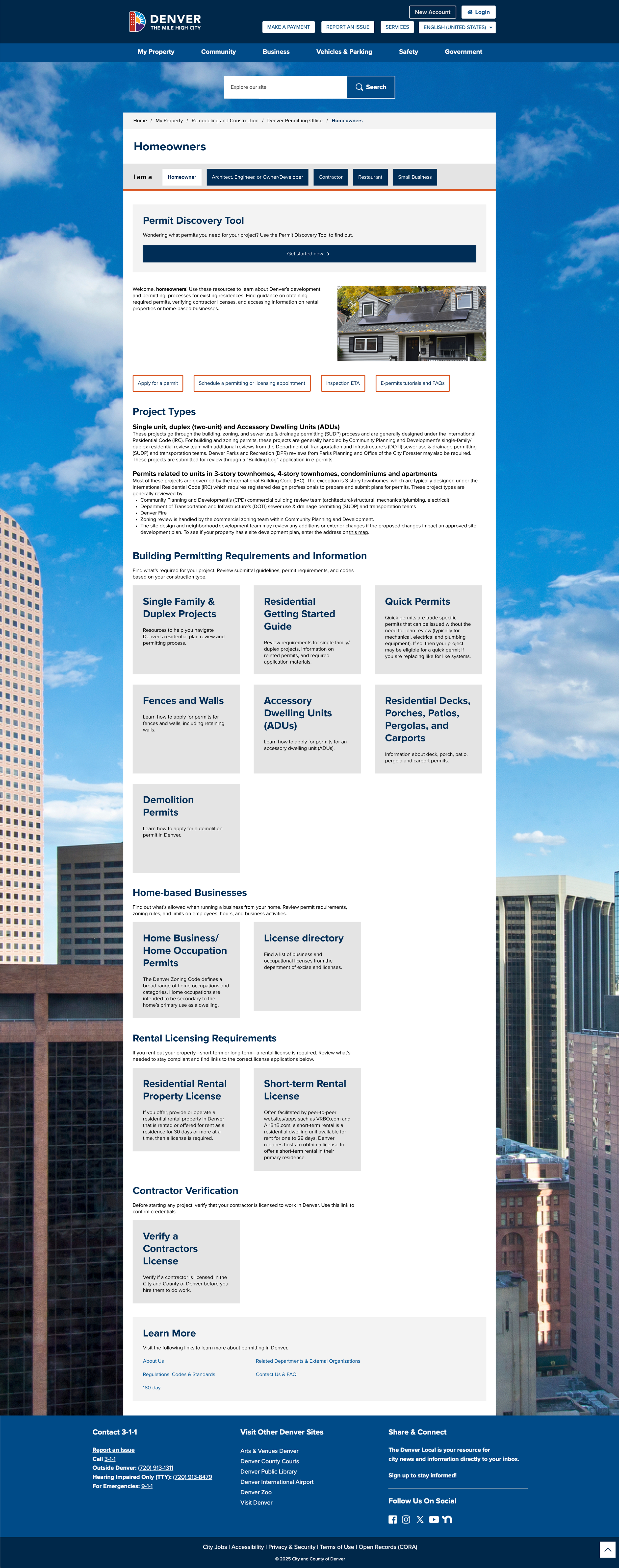
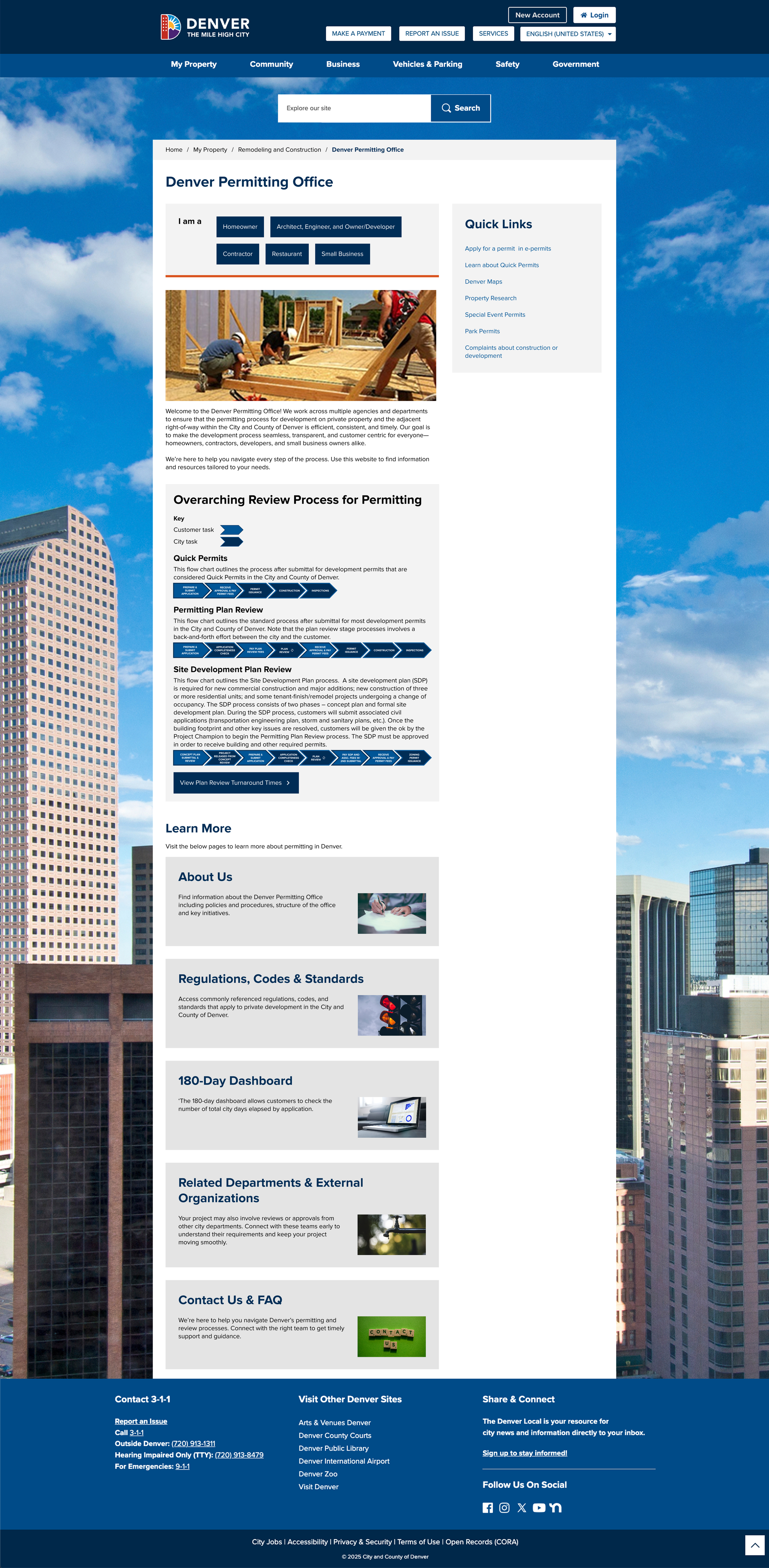
Based on the site map and using the existing Denver website design standards, I created a high fidelity prototype of the proposed redesign to test with users.
User Testing
I tested the prototype with 14 users, some from each of the 5 user groups (Homeowner, Small Business, Restaurant, Developer, Architect).
Each user type was given a task-based scenario based on the 4 user stories that user flows were created with
User feedback largely validated that the new designs were preferable to the current state of the website, and users were able to complete their tasks 90% of the time
Key Updates:
The “Permit Discovery Tool” was moved to the top of every page to ensure find-ability
We also proposed a new name for it, as users didn’t understand what it was under the original name
Created a separate page for “Related Departments” as the presence of these on the home page confused users
Some buttons were moved up in the hierarchy
Outcomes
Stakeholders and product managers were more satisfied with the final design because they had a chance to have input on the navigation and designs early and often in the process.
We spent less time making high-fidelity designs and more time ensuring we were going in the right direction by creating site maps and user flows ahead of design.
Call volume has reduced since the site updates were implemented, implying the design was successful in its main goal of improving the ability of customers to find key permitting information on the DPO site
You can view the updated website below!